Features
Home » Features
The Technology That Drives Smarter Research
StatPro is engineered to simplify the most demanding research workflows—from exploring massive datasets to creating high-precision visualizations and performing advanced statistical tests. Everything you need is brought together in one seamless, intuitive environment designed for speed, clarity, and scientific accuracy.
Instant, Precise Graphing With Live Property Controls
Generate exact graphs in seconds using a smooth, intelligent interface. All customization options—from axis scaling to color themes—are displayed clearly on the right-side property panel, allowing you to adjust settings live without opening new windows or navigating through complex menus. Every change is reflected instantly, streamlining your workflow and eliminating technical friction.
With StatPro, graph creation becomes a fluid, intuitive experience. You no longer waste time clicking through layered menus or switching between screens. Everything you need appears exactly where you expect it, helping you create stunning, accurate visuals faster than ever before. It’s the simplest way to turn complex data into meaningful stories.
100+ Advanced 2D & 3D Scientific Graph Types
StatPro offers a comprehensive library of professional-grade visualizations:
- High-clarity 2D plots: scatter, line, bar, contour, radar, dot-density, and more
- Research-level 3D visuals: meshes, surfaces, rotating models, intersecting planes with hidden-line removal
Whether you need simple comparative visuals or complex multidimensional representations, StatPro ensures you always have the perfect graph type for your scientific analysis.
With over 100 graph types available, StatPro gives you unmatched flexibility across research disciplines. Each visualization is built for clarity and precision, ensuring that subtle trends, anomalies, and patterns are easy to detect. Whether you’re presenting findings, exploring hypotheses, or preparing publication-ready graphics, StatPro equips you with the exact tools needed to communicate your data effectively.
Fully Interactive Canvas for Deep Data Exploration
Dive into your data with an advanced, interactive graphing canvas:
- Zoom directly into any point for exact values
- Rotate 3D graphs freely to examine angles, clusters, and surfaces
- Pan, zoom, and navigate datasets without lag
- Experience dynamic visual responses as you move your cursor
This free-flowing interaction helps you uncover patterns that static charts simply can’t reveal.
Our interactive canvas is designed to help you explore complex datasets with complete freedom. Whether you’re validating patterns, comparing variables, or studying surface interactions, every movement delivers instant feedback. You can highlight areas of interest, isolate specific regions, and adjust your view to reveal hidden relationships within your data. This level of precision and fluid control makes StatPro ideal for research that demands accuracy, depth, and clear visual understanding.
Powerful Large-Scale Data Handling
Importing and analyzing large datasets has never been easier. StatPro is optimized for scientific workloads and supports:
- Instant uploading of huge Excel and CSV files
- Smooth handling of high-volume datasets
- Fast execution of statistical tests and graph rendering
Whether you’re working with thousands or millions of data points, StatPro maintains exceptional performance.
StatPro is built to keep your workflow fast and uninterrupted, even under the heaviest research demands. Our optimized processing engine ensures that large datasets load cleanly, calculations remain stable, and visualizations continue to render with precision. You can merge multiple data sources, filter complex tables, and run intensive operations without slowing down your system.
From exploratory analysis to final reporting, StatPro gives you the confidence to work freely with massive datasets—eliminating delays, minimizing errors, and delivering results exactly when you need them.
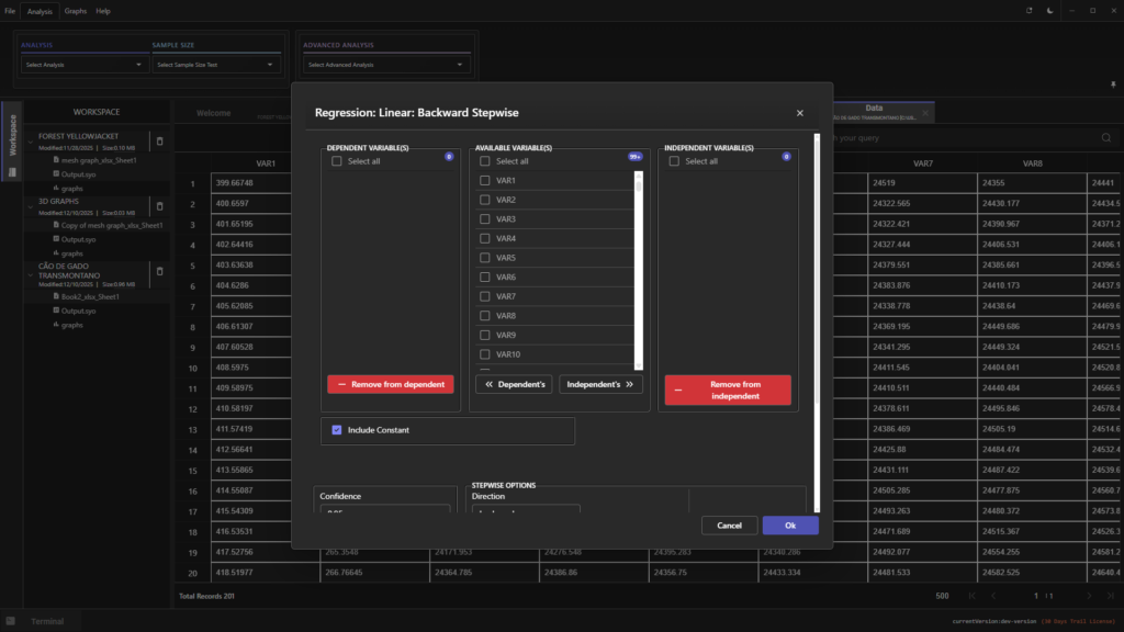
Simplified Statistical Analysis With Intelligent Guidance
StatPro makes complex statistics accessible and accurate:
- Includes 50+ widely used scientific statistical tests
- Intelligent StatMaster suggests the correct test based on your dataset
- Automatically checks for assumption violations
- Accepts raw, indexed, and structured data formats
- Generates clear, descriptive interpretation reports
- Produces test-specific graphs instantly for deeper understanding
You get both speed and scientific reliability in one unified workflow.
StatPro removes the guesswork from statistical decision-making. Whether you’re running hypothesis tests, correlation studies, regressions, or comparisons between groups, the system automatically guides you to the most appropriate method. Every test is supported with validation checks, visual summaries, and narrative interpretations, ensuring that your results are both correct and easy to communicate.
This intelligent workflow empowers researchers of all experience levels—giving beginners confidence and providing experts with the advanced precision they expect. With StatPro, you spend less time choosing tests and more time understanding your findings.
Powerful Large-Scale Data Handling
StatPro delivers publication-ready visuals with minimal effort. Our clean interface and right-side properties panel allow:
- Rapid customization
- High-quality color schemes
- Professional styling options
- Crystal-clear visual output
Perfect for research papers, presentations, and academic publications.
StatPro’s visualization engine is designed for clarity and impact. Whether you’re refining line thickness, adjusting palette gradients, modifying labels, or aligning plot elements for publication, every tool is organized for effortless access. The interface allows real-time updates, ensuring your visuals are not only accurate but visually compelling.
These high-impact visuals help you communicate ideas with authority—ideal for professional journals, classroom presentations, conferences, and peer-reviewed submissions. StatPro ensures that your data not only speaks but stands out.
Unified Workspace for a Seamless Research Experience
No switching tools. No scattered windows. StatPro consolidates graphing, analysis, formatting, results, and export options into one integrated environment. Everything you need stays visible, organized, and accessible—so you can focus entirely on discovery, not navigation.
The unified design of StatPro removes unnecessary complexity from scientific research. Instead of juggling separate programs for graphing, statistics, reporting, and exporting, StatPro brings every essential tool into one central interface. This simplifies your workflow and reduces cognitive load, letting you concentrate on interpreting your data—not managing software.
With everything connected, you save time, avoid errors, and experience a smooth, continuous flow from raw data to polished output. StatPro creates an environment that supports efficient thinking and deeper insight generation.
Magnis dis parturient montes nascetur ridiculus. Congue mauris rhoncus aenean vel elit scelerisque mauris pellentesque